
How can we help visitors to the Central Park Zoo navigate easily?
Issues of wayfinding and navigation for young families seems to be a problem for many zoos, not just Central Park. If we could create the best practices for the Central Park Zoo, we might be a good reference for other zoos as well.
Overview:
Team:
I worked as Service Designer with my classmates Amy Ashida, Christine Lawton, Yue Yuan from IxD SVA for 5 weeks.
My Role:
Ethnographer, User Researcher, Strategist and User Experience Designer
Field Trip at Central Park Zoo


Background
While all zoos are popular places for families, Central Park Zoo is a unique tourist destination in the middle of the city. Families visit from all over the world as part of their New York experience. Currently, young families visiting the zoo feel frustrated by the lack of stroller paths, stroller security, signage, lack of pricing information, and a general feeling of being an afterthought. This frustration takes away from their impression and experience of the zoo itself and may discourage them from returning. By identifying patterns of service gaps, we will be able to suggest ways that the zoo may better serve this core group of guests.
Design Process
DISCOVER
Field Trip at Central Park Zoo
“I’m a single dad with a little girl… Lack of a family restroom is so stressful at this point I actively avoid day trips anywhere without them.”
“When you first come in, you might miss the zoo.
”
“This zoo is more difficult to navigate for strollers than other zoos. There are too many stairs. And if you go into one exhibit, you can’t go down, because of stairs.”
Salient Attributes

According to response to our survey, 88.2% people reported knowing where the bathroom is as a must when they’re in the zoo. And in our interview, the central park zoo employees told us they were asked a lot where the bathrooms, water fountains and ATM are.
We also found there are other issues related to navigation and wayfinding. Here were some key quotes from the visitors interview.
CO-DESIGN
Persona
Based on user research we conducted, I created two different personas to represent families that we met in the park.


Mini Customer Journey
Current Customer Journey VS. New Customer Journey
PROTOTYPE
As we focused in on wayfinding we found that there were two opportunities for the zoo to make a big and immediate impact for visitors, especially those with young children. As we walked through the user journey we focused on the touch points of signage and the park map as the two places where visitors most depend on finding the information that they need.
Current Problem I : Visitors can fairly easily move through the park, yet have a hard time finding essentials.
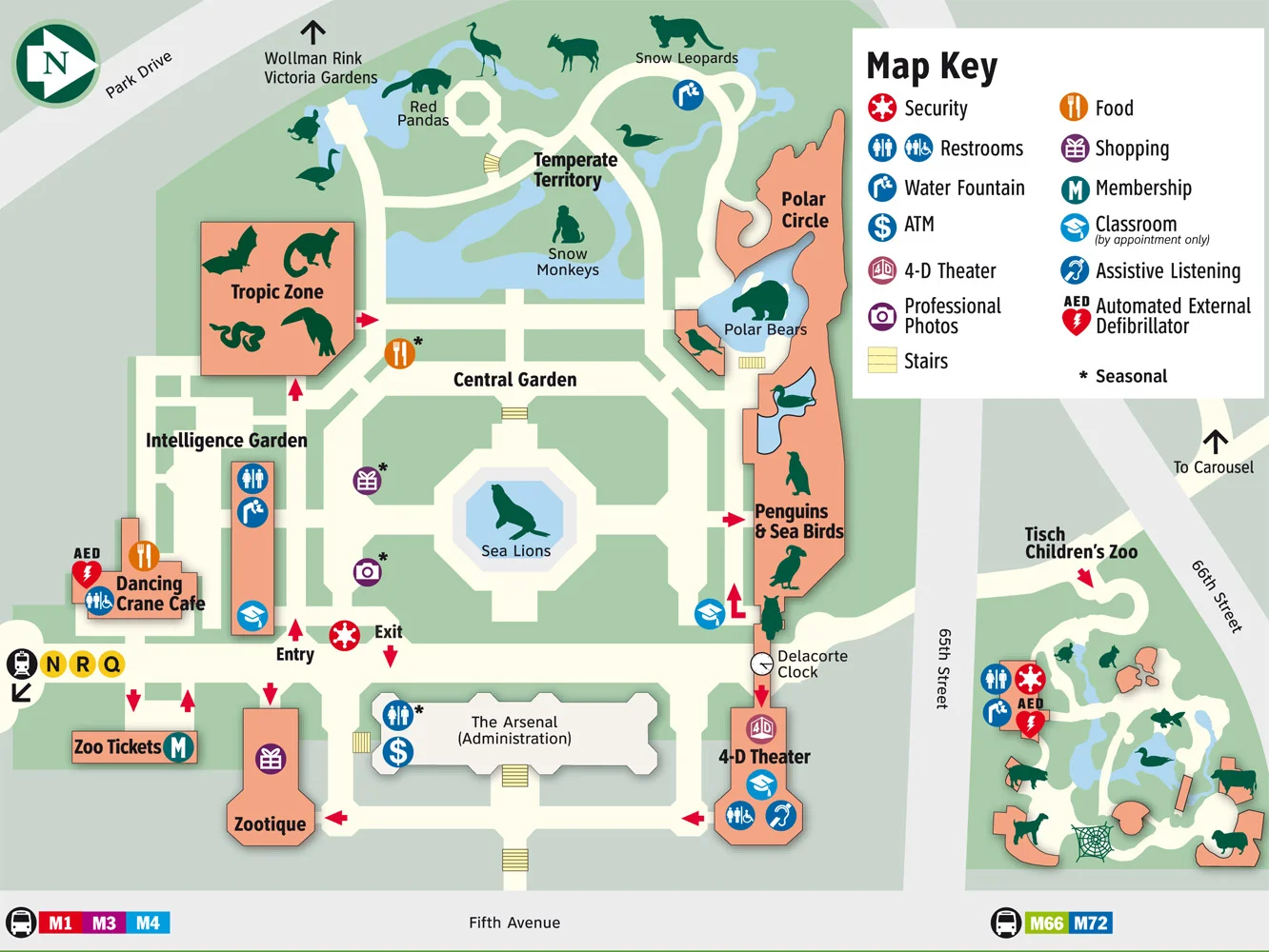
The Original Zoo Map
The first piece of our proposal is creating family themed maps. Hand-held maps are currently given to all visitors as after they buy their tickets. While on location, we watched as visitors unfold these maps and try to digest the information before entering the zoo. After surveying parents we found that the information on the map was overwhelming. What parents prioritize when they are going into the zoo is knowing where the bathrooms were, where they could find food and water, and where the animals were. They also wanted to know the best path for their family would be. Everything else on the current map was extras.
Design Solution I: Map redesign


To help families have the best experience and avoid day-ruining moments we recommend creating family-specific maps that are handed out when visitors buy their tickets.
- The information on these maps should be simplified to just the essentials.
- Different maps should be provided for families with different needs.
- The Stair Free map shows families which paths they can take to avoid stairs, which buildings don’t allow strollers, and where stroller parking is for when they need it.
- The Adventure map will show families where the interactive exhibits are for older children (and adults) who prefer exploring and don’t mind a few stairs.
- This map could also be useful for senior citizens or people with mobility problems.
- These new maps will help families prepare before they enter the zoo so they can have more control over the experience they have.
Design Solution II: Clarify Signage
During our research we found many places where the service was failing visitors because of unclear signage. To start, because of poor signage it is difficult for visitors to even locate the entrance of the zoo. After entering the signs on the building are difficult to read. Adding to the problem it is unclear which doors visitors should enter and exit through until they are about to open the door. Inside buildings the elevators are unmarked and difficult to identify. Finally, stroller parking is poorly marked, visitors aren’t aware of restrictions until they are at the door, and the signs for parking are low and are easily blocked by other visitors.

Photos of the exsting signage


Summary
Future wayfindings in the Zoo. New signs and maps are our initial solution, but they're only phase one.
PHASE I - SIGNS & MAPS

Add larger, more visible signage for important locations

Update map pamphlets with a customized ‘Family’ map
PHSAE II - PHYSICAL & MOBLE

Adding ‘info buttons’ around the zoo

Adding a mobile map that is able to be customized
PHASE III - WIFI & SMART MAP

Adding wifi kiosks with digital map around the zoo

Telling user how crowded the zoo is that day

Auto recommending
an optimized path for viewing animals
Sustainability
Essentially, in order for the first solution to be sustainable:

Signs will be regularly checked for wear and damage

When exhibits change,
so do the signs and maps

Materials and design will last for years to come