
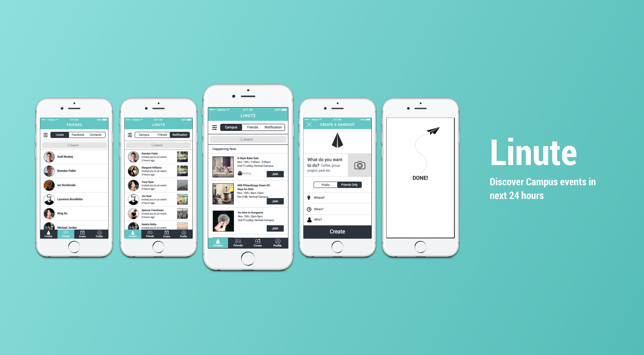
LINUTE EXPERIENCE APP
Our Stakeholders tasked us with finding out how to get college students to want to create more events to post on Linute. However, through our research, we found that college students were more concerned with finding events, instead of creating them.
Our task was to
- cut down on features that didn't make sense,
- gamified the app,
- built out the sign-up and on-boarding process,
- improved friend invites.
Overview:
Team Members: Ebenezer Gavieres, Brendan Pailet, and Ning Xu
Team:
Team Lead, UX Designer and User Researcher
My Role:
Background
Social media was intended to bring us closer; instead, it has pushed us apart, separating us behind our phone screens. Linute was created as a way to alleviate this, by allowing college students to create events, and boost socializing, and connect within the collegiate lifestyle.

Design Process
DISCOVER
Baseline Usability Test
We set up 3 tasks and one follow up questions to observe users’ behavior.

Test plan: We set up 3 tasks and one follow up questions to observe users’ behavior.
Tasks & Scenarios:
- Task 1: You are a college student.It’s Friday, and you just got out of your late afternoon class early. You didn’t plan anything. You want to have some fun and cut loose with your friends. Using the app, how would you make an event?
- Task 2: Now you created an event, you want to invite friends to the event. Using the app, how would you invite your friend?
- Task 3: You want to invite [a friend] to another event, one that you didn’t make. How do you go about doing it?
- Follow-up question: Thanks for taking our test, is there anything you could recommend for us to do moving forward?
Baseline Usability Test Findings:
- Half of users couldn’t post
- Expect to see a list of friends in Friends tab
- Trophy was ignored
- Don’t know how to message people
- Inviting to an event they didn’t create was straightforward
Heuristic Analysis
From Jakob Nielsen’s 10 heuristics, we provided solutions and best practices for future iterations.

Heuristic Analysis Findings
- Adding error messaging feedback for event creation screen
- Icons need to meet Apple Human Interface Guideline Standard
- Layout and icons need to be consistent
Competitive User Flow: Discover Events
I conducted competitive user flows and features analysis to understand areas of opportunities for Linute.


Screener Surveys
We sent out a screening survey, received 77 responses, and selected 20 potential users. We were interested in finding when/where/what/how target users created an event.


DEFINE
Users were hesitant or lethargic about creating social events. They were also looking for a simple and intuitive way to find new and relevant events.
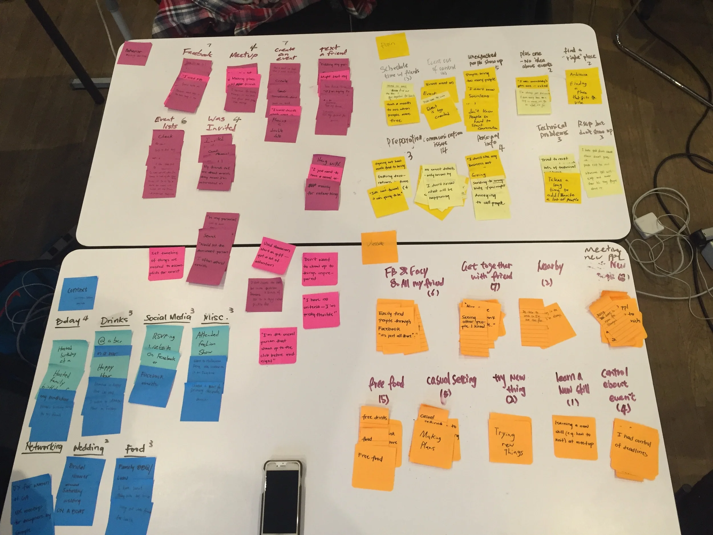
Affinity Mapping
We analyzed & synthesize data into different groups: behavior, context, pain, and pleasure points.


Personas
I created personas to serve as our reference point in understanding who we were designing for and why.


User Journey
The user journey was a visualization of how a Linute user and the Linute system would interact with one another. It is an effective way of displaying the sequence of the user experience, as well as the “how”.

DESIGN
Brainstorm design solution

Sketched low-fidelity wireframes

Presented design ideas

Brainstormed engineers and designers
Usability Test
We conducted five usability tests for rapid paper prototyping to validate the design ideas, and check if the redesigned features have worked as intended.

Usability with Atin who is a Linute user


Key Takeaway:
To design solutions, we found out users were more concerned about finding events, as oppose to creating events, based on our user research. We cut down trophy, ranking, and liking features and redesigned the discover feature and find events screen.
Deliver
Annotated Wireframes

Delivered: Annotated Wireframes
Future Recommendation
- Event detail screen: change to “repost” to “share”
- Guideline for online posting
- Error messaging and feedback for users’ activities
- Usability Test for High-Fidelity
- Design Iteration
- Implement new user interface into Apple store
From The Clients

Ning was one of the superstars that helped us tackle user experience here at Linute. Ning just gets it done. Starting from the first day, I could tell that Ning meant business. She was the one who always kept the project going and made sure that all the bases were covered. With high attention to detail, she flawlessly executed the function matrices and the swim lane flow parts of the project. Always smiling, Ning will add much needed value to any organization that she wishes to join.
-Andi Muskaj, Linute Co-founder & COO

I had the pleasure of working with Ning this past month, and recognized immediately that Ning had a great deal of insight as to how we could improve Linute's UI/UX. Over the course of several weeks, she had conducted extensive research into what would provide the best user flow for the application, as well as what updates we could make to enhance the intuitiveness of our application. Ning's professional analysis of our market came coupled with a very communicative and collaborative personality. Our product and team have benefited greatly from having worked with Ning.
-Andrew Boryk, iOS Developer