

Redesign Parsons Website Navigation
Project overview:
This was a 2-week case study to redesign the information architecture (IA) and content strategy on Parsons School of Design website based off three personas, the goals of the university, and its existing brand.

Project overview of process to conduct user research, site goals, and success metrics
Challenge:
Completed the task in 2 weeks with redesigned mobile and desktop versions.
Solution:
- Facilitate process to find the information they need
- Restructure navigation
- Consistent layout
Project Details:
My roles:
As a Information Architect, I conducted user research, card sorting, and content inventory.
- Toolkit:
Excel, Sketch, Keynote, OmniGraffle, Invision
“The organization, search, and navigation systems that help people to complete tasks, find what they need, and understand what they’ve found.” PETER MORVILLE
DISCOVER
PERSONA
Based on users' paint points, I started working on user research.


Competitive Analysis
Compared Parsons with FIT and School of Visual Arts websites on finding schedule of classes. On Parsons website, it has the quick steps to find "schedule of class", but the category: course catalog were hiding on the page.


Sitemap
The sitemap helped me understanding of the Parsons' website structure.

Close Card Sorting
This method validated the structure of the navigation whether the navigation categories match people's mental models.

User worked on card sorting

User confused with some categories

Prepared for card sorting
Define
Card Sorting Analysis
100% means all my user would like to put the card into the same category, which are the most people agreed.

Analyzed cart sorting in percentage
Key Takeaway:
- Language is confusing and ambiguous
- The meaning of navigation categories are overlapped

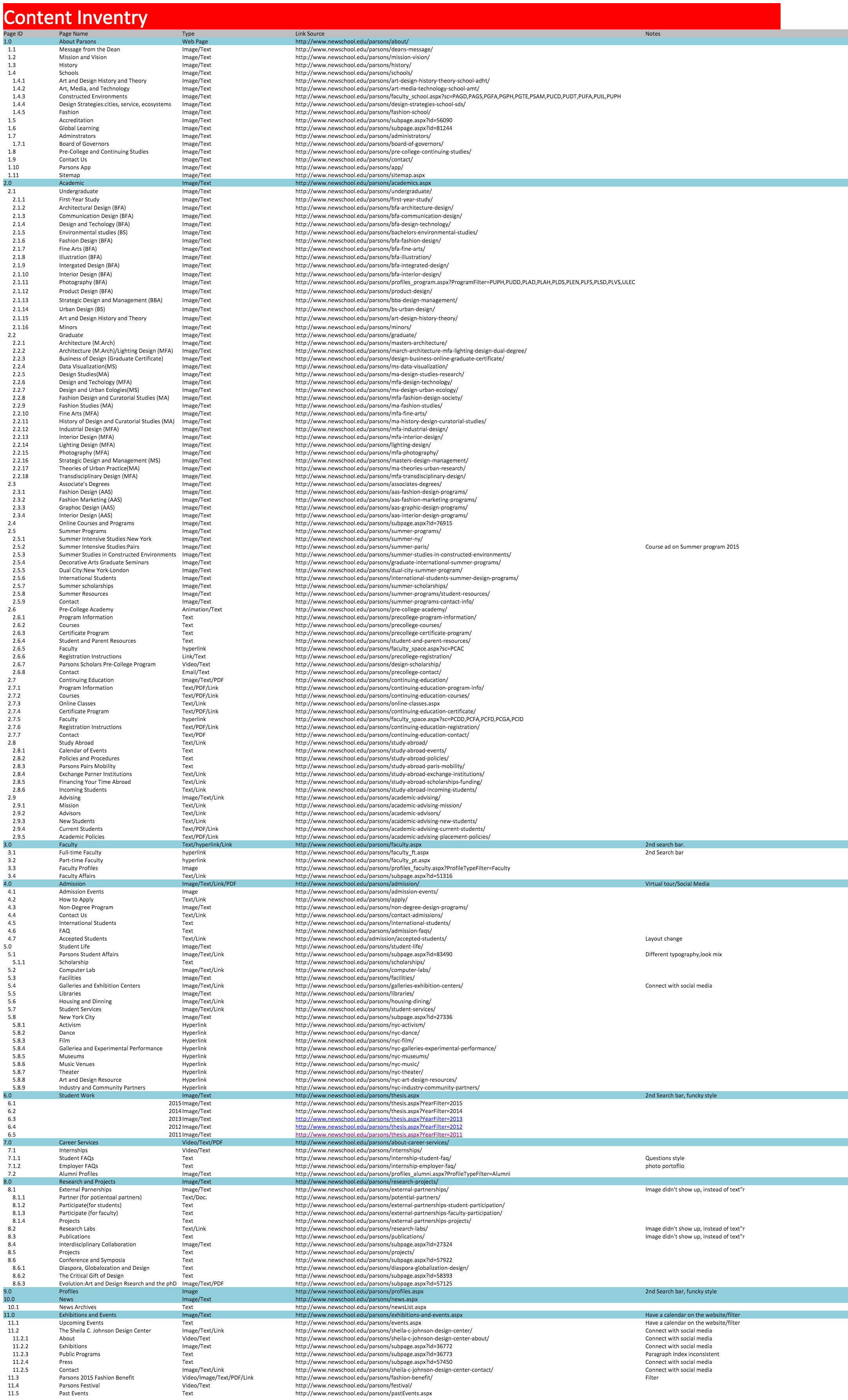
Content Inventory
Research finding: Social Media icon, Search Bar, Page Layout weren't consistent.
Content Strategies & Content management systems
Why should I care?


Content Srategies
Heuristic Analysis
Evaluated Parsons website from Nielsen Norman Group best practice.

Key Takeaway:
- Inconsistent website layout
- Unorganized taxonomy
- Too many categories
Design
Mobile Design
Low-fidelity wireframes to quick test design ideas.


Usability Test with Atin


